© Chloe Ramli
PRODUCT DESIGN & CX STRATEGIST


Product Designer
The Telegraph, 2023

Fixing a Broken Search System for 1M+ Readers Across Web & App
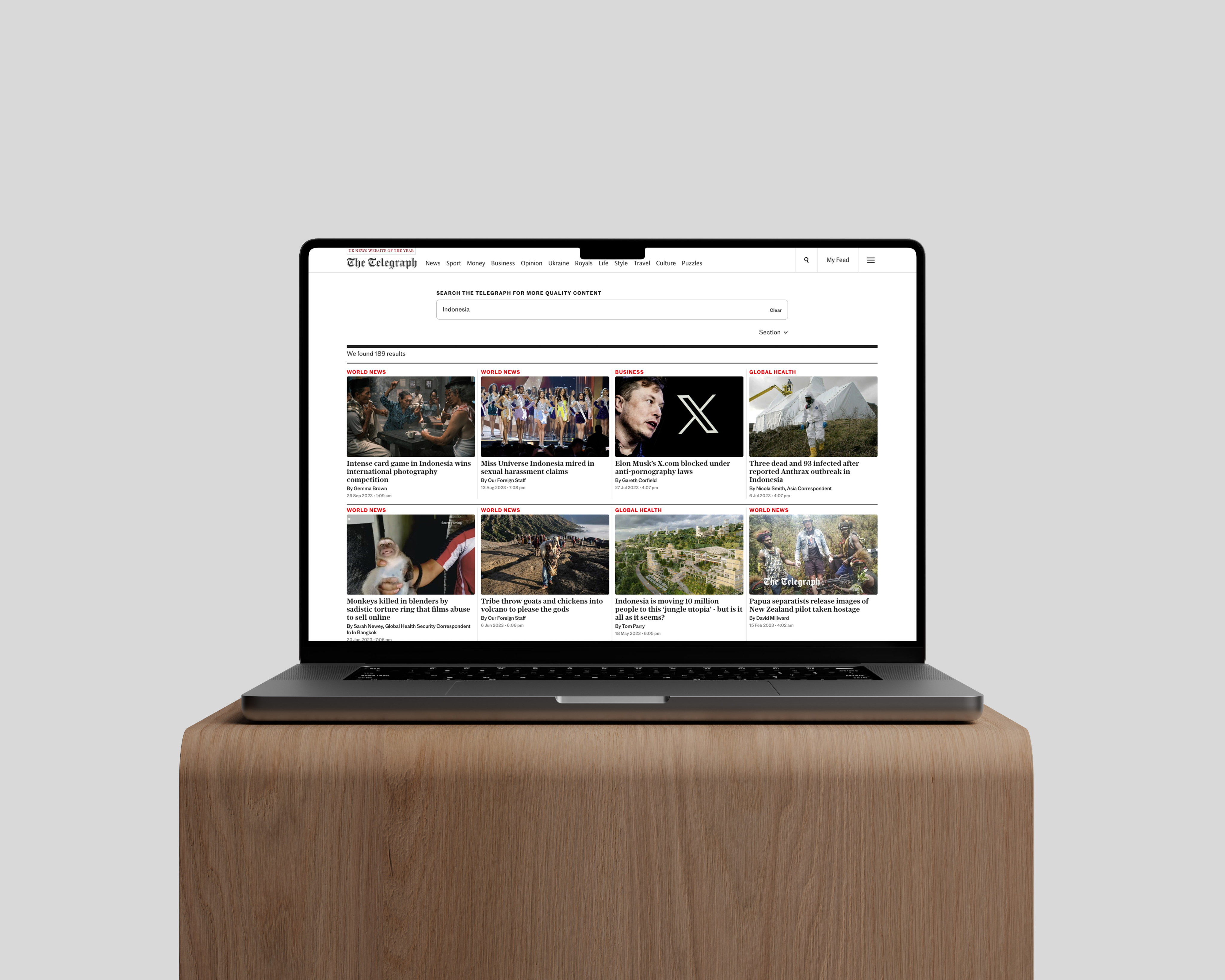
The Telegraph's previous search system, based on Google’s infrastructure, often frustrated readers with irrelevant results, hindering their content discovery.
To address this, I led the reimagining of the search experience for both web and app, working closely with our lead designer. We explored various interaction patterns and refined our solutions through continuous testing.
In the process, I improved our design system by adding reusable search components, ensuring a smooth and consistent experience across all platforms. This collaborative effort not only revamped our search functionality but also contributed to our recognition as News Website of the Year in 2024, highlighting our design team's dedication.
See Live


Back to Top


© Chloe Ramli
PRODUCT DESIGN & CX STRATEGIST
Product Designer
The Telegraph, 2023
Fixing a Broken Search System
for 1M+ Readers Across Web & App
The Telegraph's previous search system, based on Google’s infrastructure, often frustrated readers with irrelevant results, hindering their content discovery.
To address this, I led the reimagining of the search experience for both web and app, working closely with our lead designer. We explored various interaction patterns and refined our solutions through continuous testing.
In the process, I improved our design system by adding reusable search components, ensuring a smooth and consistent experience across all platforms. This collaborative effort not only revamped our search functionality but also contributed to our recognition as News Website of the Year in 2024, highlighting our design team's dedication.
See Live


Back to Top


PRODUCT DESIGN & CX STRATEGIST
Product Designer
The Telegraph, 2023
Fixing a Broken Search System for 1M+ Readers Across Web & App
The Telegraph's previous search system, based on Google’s infrastructure, often frustrated readers with irrelevant results, hindering their content discovery.
To address this, I led the reimagining of the search experience for both web and app, working closely with our lead designer. We explored various interaction patterns and refined our solutions through continuous testing.
In the process, I improved our design system by adding reusable search components, ensuring a smooth and consistent experience across all platforms. This collaborative effort not only revamped our search functionality but also contributed to our recognition as News Website of the Year in 2024, highlighting our design team's dedication.
See Live


